Art Direction
As the creative director at Freya, I’ve been responsible for shaping our brand’s identity, ensuring it reflects our mission of revolutionizing urban gardening. My role has been about visually capturing the essence of what Freya stands for—empowerment, sustainability, and innovation.
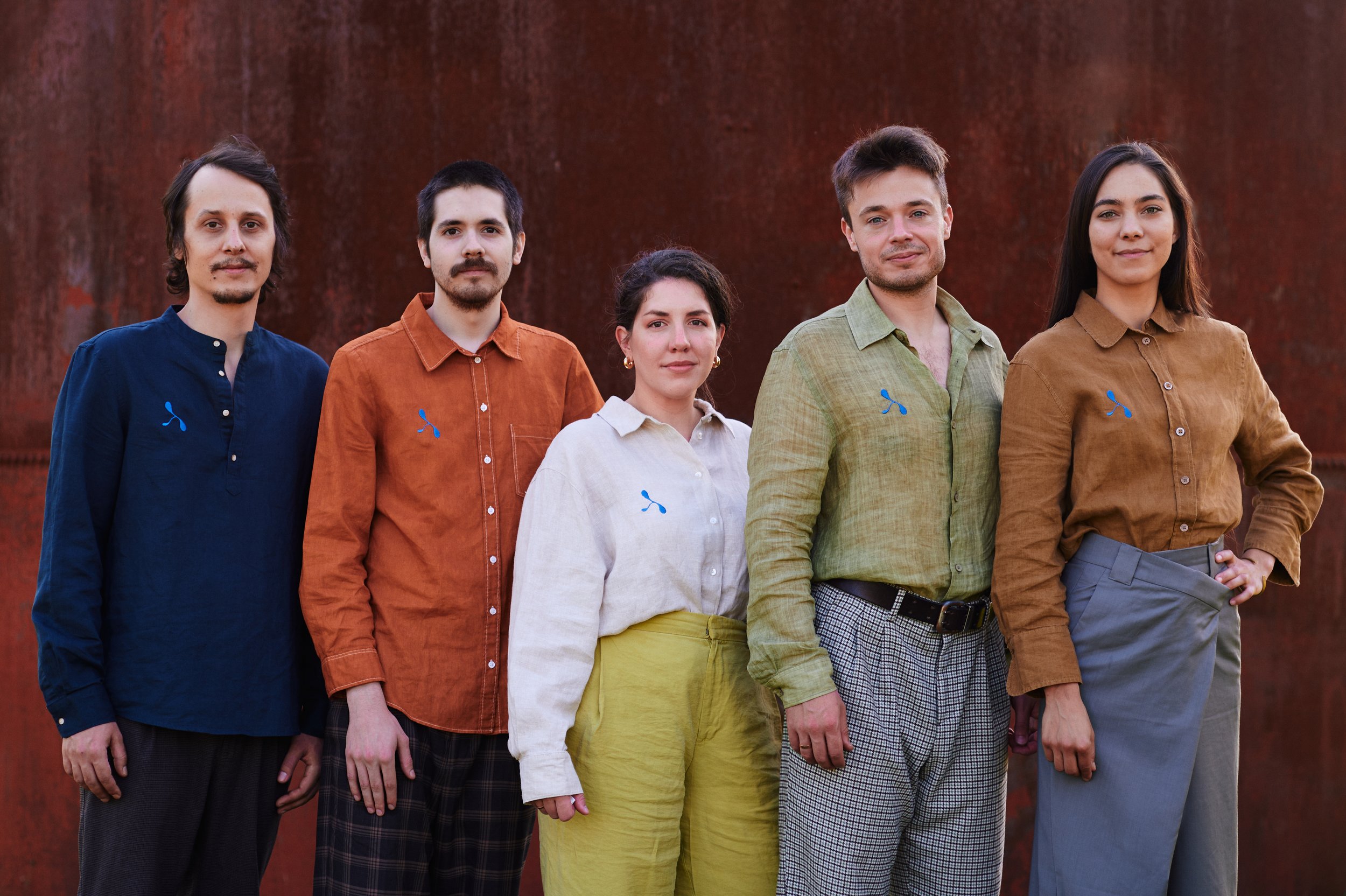
One of the key elements I art directed is our logo, which serves as the face of our brand. It was designed to be more than just a symbol; it represents growth, both literal and metaphorical. The concept was to keep it abstract but that people can associate drops or some kind of a little plant, but to leave space for the imagination since the brand aims to serve a wide range of products and services. The simplicity of the logo speaks to the accessibility of our product, while its organic forms and subtle curves nod to nature and the future of gardening. Each aspect of the design was carefully considered to ensure it reflects the seamless blend of technology and nature that Freya embodies.
This identity extends across our visual storytelling, where every piece of content—from explainer videos to marketing materials—reinforces our brand’s core values. By uniting all these elements under a cohesive creative direction, I’ve aimed to build a brand that resonates with our audience, inviting them to be part of a greener, more sustainable future.


